Residential Building, collaboration with Emilio Lancia, Milan, Via Randaccio 1924–26
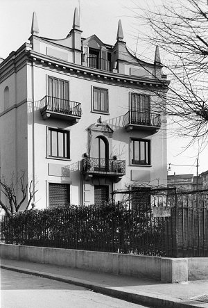
Residential Building Via Randaccio, exterior view, Milan
© Gio Ponti Archives, Milan
During the First World War, as a young soldier Gio Ponti had the opportunity to lodge in several abandoned villas designed by Andrea Palladio, which he sketched abundantly. This admiration for the Renaissance architect stayed with him throughout his life (…) Niches, urns, entablatures, tympanums, obelisks: this architectural vocabulary is transposed with humorous lightness into his building on Via Randaccio, the first building Ponti designed – in collaboration with Emilio Lancia – and where he resided with his family from 1926 to 1936.
The building plan fans out with four facades, each possessing its own distinctive rhythm. The concave facade overlooking the garden, the most ornate, resembles a small Palladian theatre (…) Each floor is imagined as an apartment unto itself, with rooms distributed around a circular antechamber that divides the living area from the sleeping area (…) Ponti would later recall this first building, designed in the “Novecento” spirit, as an example of “architecture for architecture’s sake.” By Sophie Bouilhet-Dumas.
Borletti Building, collaboration with Emilio Lancia, Milan, Via San Vittore, 1928
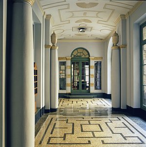
Borletti Building, entrance hallway, Milan, 1928
© Gio Ponti, Archives, Milan
With the apartment building in Via Randaccio in Milan in 1924–26 and L’Ange volant in Garches in 1927–28, the Borletti building numbers among Gio Ponti’s very first architectural realisations. Built in collaboration with the architect Emilio Lancia, this luxurious eight-story construction destined for the Borletti, one of the great families of the Milanese commercial middle class, daringly reinterprets the neoclassical stylistic repertoire in a “Novecento” spirit. Obelisks, oculi, niches, panels and balconies decorate the facade with a certain formal sobriety, as does the interior courtyard to which equal importance is accorded. By Sophie Bouilhet-Dumas.
Laporte House, Milan, Via Benedetto Brin, 1935–36
The Laporte House is subdivided into three apartments spread over four floors. Each apartment has a unique plan that respects the Pontian division of interior space into three areas: day, night and services. The double height of the top-floor apartment makes it possible to design its living spaces from multiple points of view, especially the large open volume of the living room-dining room. (…)

Inside Gio Ponti’s family apartment, Casa Laporte, Milan, 1936
© Gio Ponti Archives, Milan
Finally, echoing the ideas of Le Corbusier regarding the roof-terrace and reinterpreting the structure of the Pompeian villa gardens, Ponti conceived a vast rooftop terrace that takes up half of the uppermost floor. With its pond, its vegetable garden and its sandbox, it’s considered as an entirely separate room. Surrounded by walls that alternate with pergolas and equipped with Italian-style retractable awnings, it has “the sky for a ceiling.” “The house becomes a creation, a unique composition of spaces and of light that, put into relationship with one another, arouse in us emotions that are more beautiful, fresher, closer to architecture and our vision of life,”
wrote Ponti on the subject of this house on whose top floor he lived between
1936 and 1943. By Sophie Bouilhet-Dumas.
Case tipiche, Milan, 1931–38
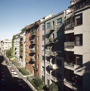
From left to right, Domus Fausta, Domus Carola and Domus Julia, Milan 1931-1936
© Paolo Rosselli
The case tipiche (“typical homes”) refer to a group of residential buildings designed by Gio Ponti for a number of general contractors and located in various Milan neighbourhoods. (…) In his view, the home was an orderly place, a receptacle of the joys of life and the beauty of the world, which must be able to reflect civilisation at its highest point. These domus also inaugurated a new architectural style. Despite using numerous traditional elements of Italian architecture, their essential lines bring them closer to the more rationalist, Modernist aesthetic. The homes in Via Letizia were conceived to form neighbourhood units and compose a harmonious, modern, and colourful urban landscape. Gardens serve as a transition between the buildings and the street. While variations in volume and typology are reduced, each building nevertheless conserves a degree of originality. Balconies, terraces, loggias and bay windows constitute the minimalist decoration of the facades and recall the architect’s belief that roofs and facades are made for being lived in just like the rest of the house. By Sophie Bouilhet-Dumas.
First Montecatini Building, Studio Ponti-Fornaroli-Soncini, Milan, Largo Stati Uniti d’America, 1936–38
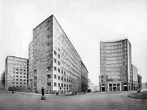
First Montecatini Building, exterior view, Milan, 1936–38
© Gio Ponti Archives, Milan
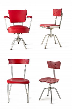
Chairs for the Montecatini offices, 1938
Manufacturer: Ditta Parma Antonio e figli. Aluminium, imitation leather, bakelite
© Vitra Design Museum Jürgen Hans et Andreas Sütterlin[en]© Weil am Rhein, Vitra Design Museum. Photographs Jürgen Hans and Andreas Sütterlin
Exemplary creation of Milanese
rationalism of the 1930s imagined down to the smallest details by Gio Ponti for the chemical group Montecatini, this office building constituted a veritable revolution in the architectural and working worlds and contributed to the advent of industrial design in Italy. Commissioned by the group’s president, Guido Donegani, and built in record time (less than two years), with the collaboration of engineers Antonio Fornaroli and Eugenio Soncini and work supervisor Pier Giulio Bosisio, it bears witness profound economic and social changes that Milan had experienced. Indeed, with the development of the service sector there emerges the figure of the office worker in a city that saw its population double in less than twenty years. (…)Service areas available to personnel after work (library, dressing rooms, hair salon, pharmacy, bar, deli, clothing store) were located on the basement level. Finally, ever in pursuit of the idea of bringing out the best in workers, a glass partition made it possible to see the cooks at work in the dining hall kitchen. By Sophie Bouilhet-Dumas.
Tradition and Modernity at the University of Padua
His first intervention in the Palazzo del Bo took place for free. (…)Ponti conceived and created a magisterial path, the Scala del Sapere (“Staircase of Knowledge”), which made it possible to access the rooms he recreated without having to suffer any intrusion from the blinding brightness of Fagiuoli’s courtyard. The ascent up to the main floor gives its entire breadth to the project. There, too, the treatment of the architecture relies on the use of colour: not only the frescoes but the entire monumental staircase, or the precious marbles that decorate the steps, offer a basic tone in relationship with which the pictorial cycle is deployed in perfect harmony. This ascent, to the rhythm of the conquests of knowledge, actually prepares the spectator for the soft, Mediterranean colours of the president’s office, which completes the tour of the courtyard. (…)In reality, the architect discussed even the smallest choices with the rector, guiding him on visits of the workshops of the artists with whom, often, he had shared the experience of the Milanese Triennale. Nevertheless, it was above all in the main rooms that we can fully appreciate the acuity of his gaze, for he refused to conceive of the content as separate from the container. For Ponti, architecture was design and viceversa: thus, in the great Basilica room, the diamond motif that characterizes the ceiling is elegantly evoked on the backs of the banquettes and the red of the columns, doubly narrow, magnifies the giant walls painted by Pino Casarini.

Basilica, Palazzo del Bo, University of Padua
© Tom Mannion
This space, which painting could crush or annihilate, is transformed into a structure of colour: it permeates the visitor, who penetrates in this way into the heart of the heroic narrative deployed around him and participates in it. This decision to envelope the volume is also found in the older spaces where Ponti intervened: in the medical room, his desks evoke the mouldings of the consoles that support the 14th-century ceiling, almost as if they reflected their aesthetic quintessence onto the surrounding walls.
Ponti’s modernity is certainly functional, but it’s also careful to insert itself into the complicated weave of the memories of the past; his classicism is undeniable, but as a perfect point of equilibrium between practical necessities and the aspirations of the imagination. A lesson that won’t be forgotten. By Marta Nezzo.
Pirelli Tower, Studio Ponti-Fornaroli-Rosselli, Collaboration with Giuseppe Valtolina, Egidio Dell’Orto, Arturo Danusso and Pier Luigi Nervi, Milan, Piazza Duca d’Aosta, 1956–60
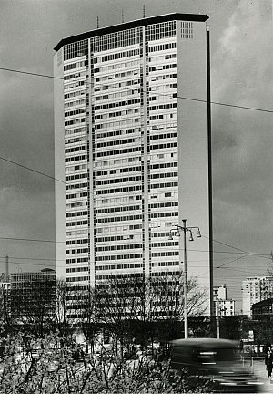
Pirelli Tower, Milan, 1960
© Milan, 1965 / Paolo Monti
A symbol of Milan’s economic dynamism and of the euphoria of the post-war period, it was built for Pirelli, a company specialising in tyres and rubber goods, in place of the production workshops destroyed during the war. 127 metres and 31 stories tall, situated right in the heart of Milan, across from the central train station, this building was, at the time of its inauguration, one of the tallest in Europe.
Its construction was the fruit of the collaboration between Gio Ponti and his studio and engineer Arturo Danusso, and starting in 1954 with Pier Luigi Nervi, both of whom were experts in prestressed concrete and advised Ponti on the building’s form and structure.
Following the experience of the Montecatini building, Gio Ponti solidified with this project his theory of the forma finita (finite form) by opting for a volume that would admit neither additions nor removals. (…) By Sophie Bouilhet-Dumas.
Interior Design of the Hotel Parco dei Principi, Sorrento, 1960
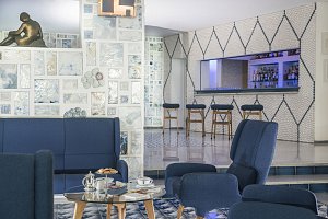
Lobby at Hotel Parco dei Principi in Sorrento
© Hôtel Parco dei principi, Sorrento
After having Gio Ponti supervise the interior design of the Royal Continental Hotel in Naples, its owner, Roberto Fernandes, solicited his intervention once more for the creation of the Hotel Parco dei Principi in Sorrento (1960), as well as its companion structure in Rome (1961–64). With these commissions, the architect renewed his research of the 1930s on the Mediterranean residence and on hotels in general. Following the example of the Dane Arne Jacobsen, who designed the Radisson Blu Royal Hotel in Copenhagen several years earlier, Gio Ponti implemented his conception of the hotel as a comprehensive work of art.

Ceramic tile by the Ceramica D’Agostino factory for Hotel Parco dei Principi in Sorrento
Ceramica D’Agostino
© Gio Ponti Archives, Milan
Ponti opted for a chromatic solution that immersed the eye in white and blue, as if welcoming the external environment inside the hotel. He developed, with the aid of Ceramica D’Agostino in Salerno, thirty tiles of 20 centimetres per side decorated in blue and white motifs which, assembled and arranged in different ways, made it possible to obtain hundreds of different floors, sufficient to make each room unique.
The ceramic plates that welcomed visitors in the entrance were made by Fausto Melotti and the ceramic shingle by Ceramica Joo. The latter recalled the grotto walls in Baroque gardens; this metaphor is continued in the hotel’s park where Ponti imagined a swimming pool “as a reflecting pool for wood nymphs,” from which emerges a diving board on an island in the middle of the water. By Sophie Bouilhet-Dumas.
Plan for a family house, 1964
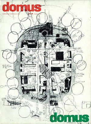
“Domus” Cover n. 414, May 1964
© All rights reserved
In 1964, Gio Ponti published in the pages of Domus a plan for a family home, a prototype entitled Lo Scarabeo sotto una foglia (Beetle under a leaf ), the layout of which he presented to readers on a 1:50 scale. This small oval house was entirely covered in white and green ceramic tiles, both inside and outside, including the roof. Thanks to the brilliance of the tiles and the choice of colouring, the home’s facing was supposed to absorb the surrounding landscape and fuse with it, like a beetle with its shell. Imagined like a leaf fallen to the ground, its projecting roof protects the facades from the rain and sun.
In 1966, the avant-garde art collector Giobatta Meneguzzo commissioned his own version of the “Beetle” in Malo, in the province of Vicenza. Following Ponti’s advice, he enlisted designer Nanda Vigo to design the interiors. Completely tiled in white and famous for its spiral staircase covered in grey fur, it housed an important collection of contemporary art with works by Lucio Fontana, Agostino Bonalumi, Julio Le Parc and Raymond Hains. A monumental white monochrome was created specifically to decorate the walls of the entryway. Soon after its inauguration, this house became a gathering place for the artists, art critics and art dealers of the time. By Sophie Bouilhet-Dumas.